

I led a full visual rebrand for Opportunity Presbyterian Church, creating a new identity that feels welcoming, grounded, and distinctly their own. I developed the logo, color palette, typography, and supporting marks, then carried the new look across business cards, posters, signage, and other church materials. I also designed the church’s website, bringing the new identity together across both print and digital spaces.
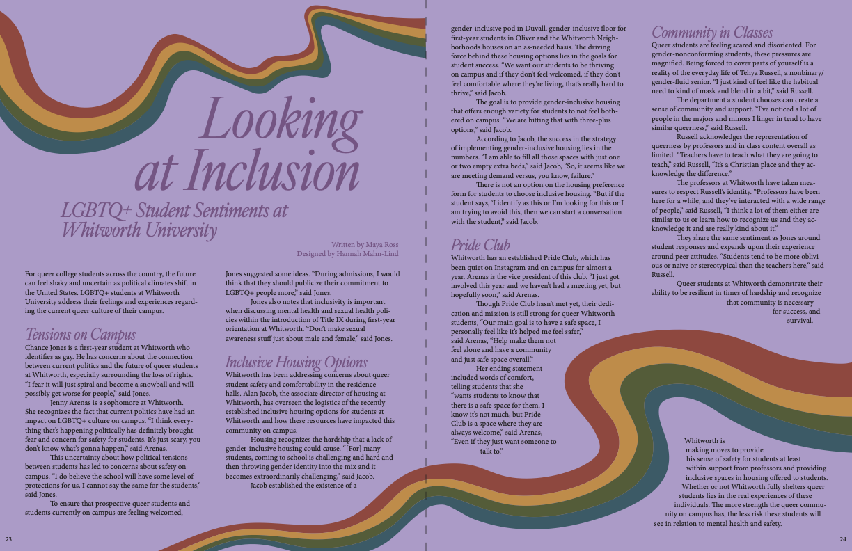
As Head Designer for Whitworth’s In the Loop magazine, I designed this spread for an article exploring LGBTQ+ student experiences on campus. With no photography to work from, the colorful, flowing shapes became the visual thread throughout the spread, giving the article its own personality while creating movement across both pages. I especially enjoyed finding a way to make a text-heavy story feel inviting and visually engaging without taking away from the writing.

I wanted this poster to feel as energetic and playful as the music it was promoting. Inspired by Luciano Cian’s NFT BLUE NOTE São Paulo, I built the composition around bold colors, geometric shapes, and illustrated percussion instruments, creating something that would catch people’s attention as they passed through the music building. The textured, vintage-inspired look gives it a little extra character while keeping the concert details easy to find.
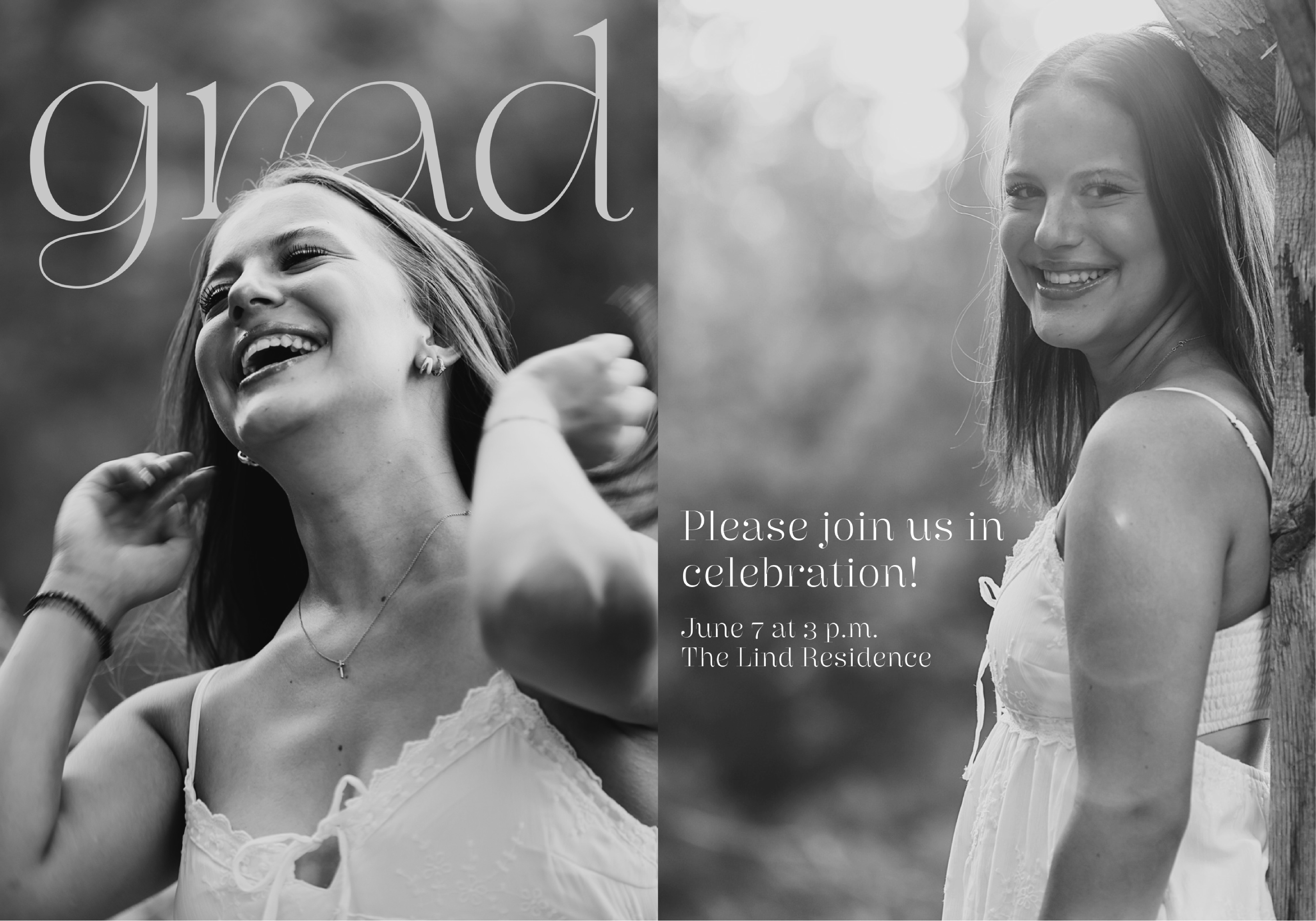
I designed this graduation invitation with a simple, editorial feel that lets the photography take center stage. I wanted the design to feel personal and celebratory without becoming overly formal, using black-and-white imagery, delicate typography, and a clean layout to give it a timeless quality.

Created to promote Whitworth’s Meaningful Life course, this poster gave me the chance to play with a little more personality in the design. I used the mountain photo as a starting point and paired it with oversized type, soft textures, and a playful layout that gives the piece a sense of movement. The finished poster feels thoughtful without taking itself too seriously, which felt like a nice fit for the course.
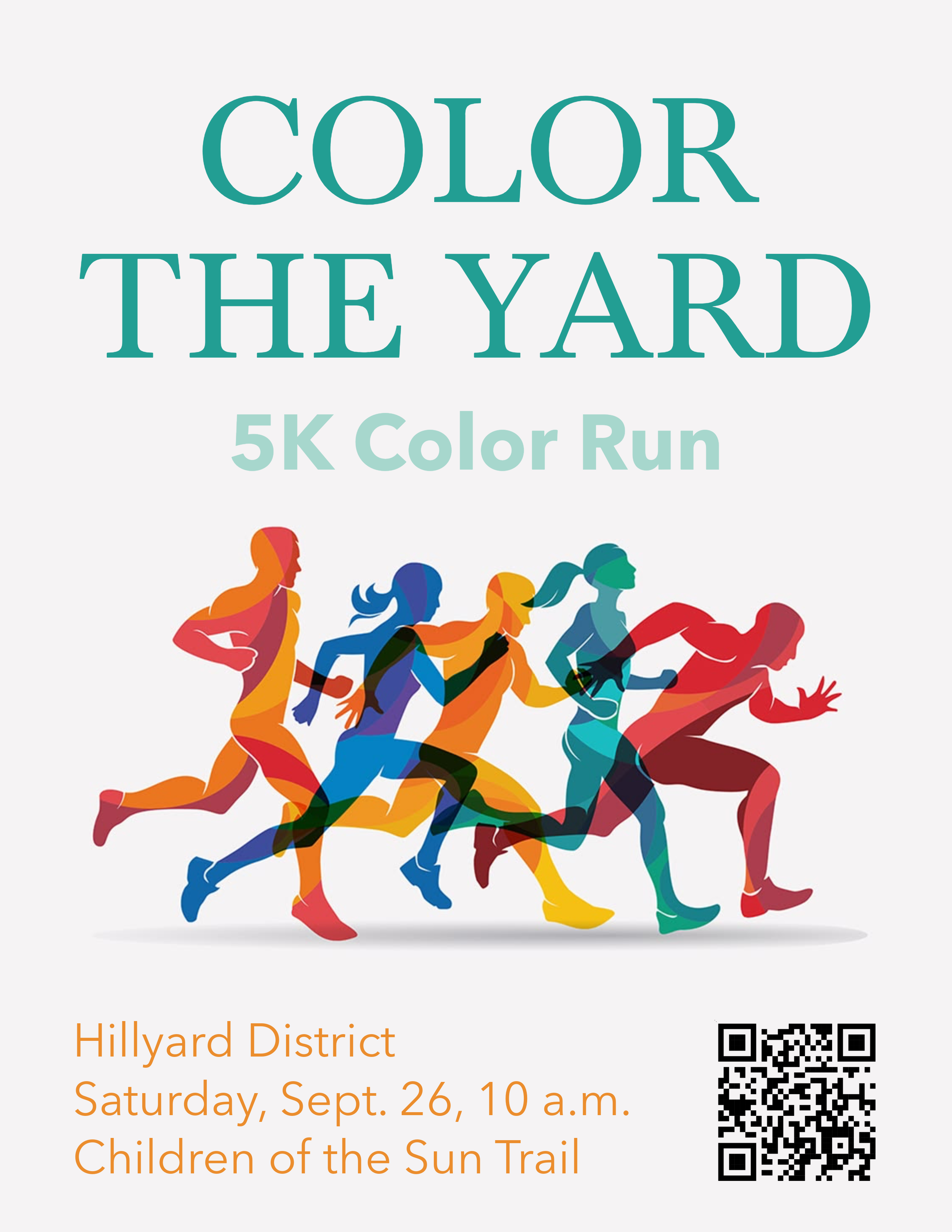
Color the Yard was a fictional 5K created for a public relations campaign for the Hillyard Creative District. I designed the poster to feel colorful, approachable, and full of energy, using the overlapping runners and bright color palette of the Hillyard Creative District to give it the feeling of a community event in motion. The poster was part of a larger campaign, so I also got to think about how the event’s visual identity could carry through its other promotional materials.

This custom poster was created as a piece of wall art inspired by Taylor Swift’s The Eras Tour. I used the opening lyrics from the tour to build the typography into the photograph, letting the words become part of the image rather than simply sitting on top of it. The mix of oversized outlined lettering and smaller details gives the piece a bold, layered look while still keeping the photograph at the heart of the design.